When it comes to YouTube branding, fonts are the unsung heroes of your channel’s look and feel. Think about it – your text style in thumbnails, channel art, and video captions is like the outfit your content wears. A timeless font can make your channel appear polished and consistent, while a poor choice might feel as off-putting as Comic Sans on a resume. In this article, we’ll explore how choosing the best fonts for YouTube can enhance your brand identity, give your channel a professional YouTube design flair, and even help boost your YouTube subscribers (no, a font isn’t a magic “get subscribers quick” scheme, but it definitely helps!). We’ll keep things clear and informative and sprinkle in a bit of fun along the way.
Wait, Do Fonts Really Matter?
Actually, fonts visually convey tone of voice. Fonts are what people notice first when they scroll through your channel banner, video thumbnails, or intro screen—long before they consume a single word.
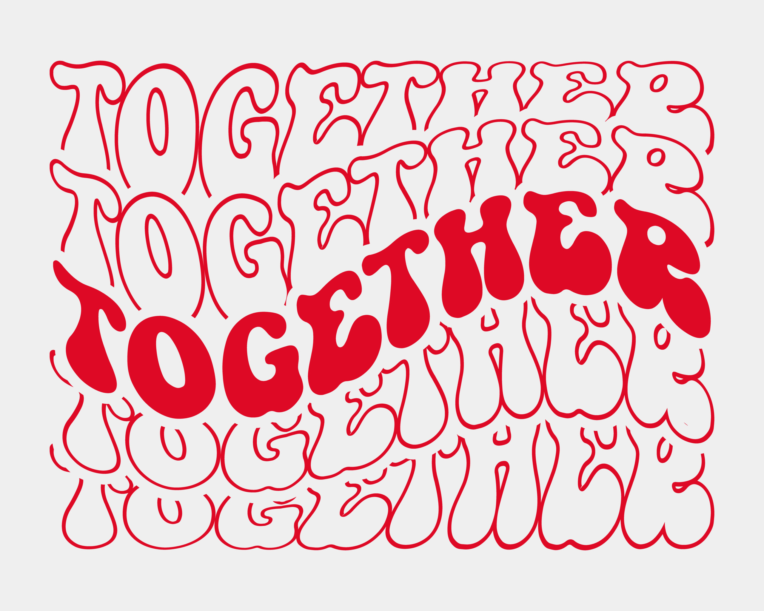
Ever see one of those thumbnails that’s full of bubble letters everywhere, all neon green on black? Clicked? No, of course.
Your choice of font makes your material professional, trustworthy, or fun. And that’s before you’ve even pressed the record button.
What Are Timeless Fonts Then?
Timeless fonts are like that one timeless black jacket in your closet: they never go out of style, and they go with nearly anything.
They’re readable. They’re elegant. They make everything look elegant even if your video was edited together at 2 am with one eye open.
What am I talking about? Here are some examples:
• Garamond – Gives your titles a touch of sophistication.
• Helvetica – Cleanly modern and crisp, but not cold.
• Futura – Great for a clean, geometric, futuristic look.
• Baskerville – Subtle drama. Positively so.
• Roboto – A workhorse go-to that’s gentle on the eyes on the screen.
These fonts aren’t just about “aesthetic” either—they aid legibility, particularly on small screens, and get your visuals seen without screaming.
Timeless Fonts and Fame Merging: Subscriber Growth
The frustrating thing is that even if your graphics are incredible, the algorithm will essentially overlook you. When you’re starting out on YouTube, you may feel as though you’re shouting into the void. You’re making videos, thumbnailing, and nailing your intros, but nothing is moving.
We’re not talking about shady websites where you can purchase 50,000 subscribers for $10 and receive a virus as an added bonus. We’re talking about reputable, human-run sites that provide creators with a boost. These websites get your channel noticed, get you viewed sooner, and—best of all—get the YouTube algorithm to think your video is worth watching.
The goal of this tactic, if utilized properly and intelligently, is to get more individuals to see your content quicker. When will they come? They will stick around if you possess decent branding, coherent imagery, and good content (readable text that’s obviously readable, engaging thumbnails, and coherent messages).
You’ve done the hard part—you’ve tidied up your channel, replaced sloppy typography with classic, beautiful fonts, and established a visual identity consistent with the quality of your content. Now what?
The reality is that if nobody sees your channel design, it will not matter how great it looks. The second essential aspect is visibility. Due to this, you can now build the momentum you’ve been craving by combining improved design with a solid means of achieving more subscribers. The aim is to set up the correct premises for actual improvement, not to manipulate success.
In short, great visibility is a precondition to great design. Your YouTube channel is something that folks linger on instead of something they happen to stumble upon when a savvy growth strategy is married with typography and fame.
Apply Fonts Like a Boss
YouTube subscribers depend on more than just the content of your videos; it also depends on how your channel appears before anyone even hits a play.
This is the strategy:
1. Choose one or two classic typefaces that are appropriate for your niche. Clear, easy to read, and seldom utilized.
2. Make use of those fonts on your content, including end screens, lower thirds, intros, video titles, and thumbnails.
3. Use straightforward, reusable templates to create a unified style. Don’t start from scratch every time you upload.
4. Combine your enhanced visual game with a subscriber increase from a service that truly delivers to get noticed more quickly.
5. Your content will take care of the rest.
FAQ
Do fonts have a significant role in YouTube subscribers?
Indeed! Fonts have an impact on professionalism, mood, and readability. Poorly chosen fonts can cause users to scroll past your image, while a well-chosen font can make it stand out.
Where can I locate classic fonts without getting sidetracked by spam?
Serifs and display fonts are among the many possibilities available in a reliable and free font collection on the internet.
What characteristics make a font “timeless”?
Decades after their creation, timeless fonts remain readable and adaptable. They don’t depend on ephemeral trends to seem relevant because they operate across platforms.
Is it true that fonts have an impact on my subscriber count?
Yes, indirectly. Using high-quality fonts increases your visual appeal, which in turn increases viewer trust and click-through rate. Over time, that may result in more subscribers.
All OK, but really, should I buy subscribers?
It varies. Subscriber boosts from reliable sources can be helpful if you need a little boost to get your channel off the ground. Anything that promises “10,000 subs in 5 minutes” should be avoided.
I don’t do design. Is everything about fonts too complicated?
Not at all. Applying your chosen fonts consistently is made incredibly simple by apps. Consider it similar to making your own channel “uniform.” Simple, fashionable, and replicable.