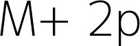
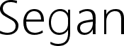
Aaargh, a free quirky sans serif by Tup Wanders from 2004, has the loose, slightly offbeat feel of a hand-drawn modernist sketch. The letters pair round, open bowls with lanky verticals and a few sharp moments - especially that tall A and the dipping g - so the font feels casual, airy, and a little wry rather than slick.
It fits poster headlines, book covers, indie magazine titles, cafe branding, and simple packaging where a free font can carry a conversational voice without turning cute. Short phrases, title cards, and logo-style wordmarks suit it best, because the roomy curves and uneven rhythm give even a plain word a distinct silhouette.
--
- Tall, simple uppercase A
- Rounded, single-storey forms
- Long, curling tail on the lowercase g
The designer also created a thin font similar to Avant Garde.
https://www.tupwanders.nl/