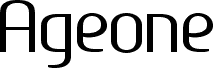
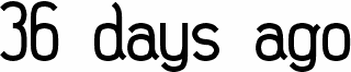
Ageone, Benoit Sjoholm's 2010 free geometric sans serif, has a calm, rounded rhythm that feels modern without turning cold. Broad circular forms and softly squared joins give the letters an even, almost monoline presence, while details like the single-storey g and open, airy curves keep it from feeling too neutral.
It suits identity work, app and web headers, packaging, poster titles, and magazine cover lines where you want a clean voice with a slightly human edge. As a free font, Ageone also makes sense for short branding systems, title cards, and wayfinding-style graphics, because the smooth geometry keeps brief words looking steady and composed.