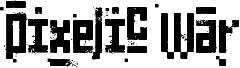
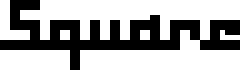
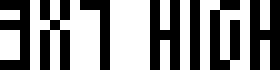
Ancient G Modern by Gen Aris is a free pixelated bitmap font with a stark, futuristic character. Built from chunky rectangular strokes, square cut-ins, and abrupt stepped corners, the letters feel like coded signage translated through an early computer screen.
Its rigid geometry fits game interfaces, sci-fi posters, electronic music artwork, and tech event graphics. This free font works best in short headlines or title cards, where the unusual openings and interlocking block shapes have enough room to register without losing their strange, monumental rhythm.
--
Ancient G Modern is an extension of the SGA/SG1 ANCIENT canon glyphset that provides a fuller font. It distinguishes case and includes punctuation and extended characters.
Questions or comments can be directed to me at
genaris at gmail dot com
by Gen Aris -Inspired by fan fonts Anquietas, Alteran, & my personal prefs . . .
Font family
Ancient G Modern
Font subfamily
Regular
Unique subfamily identification
Ancient G Modern:Version 1.00
Full font name
Ancient G Modern
Name table version
Version 1.00 September 26, 2008, initial release
Postscript font name
AncientGModern
Trademark notice
FANS are welcome to USE or MODIFY at will but please RENAME any modified versions you may create as to avoid confusion. :)
Manufacturer name
Gen Aris
Designer
Gen Aris
Description
A variant of the ANCIENT glyphsets used by the Ancients in Stargate: Atlantis.
The purpose with this revision is to CREATE PUNCTUATION and ADDITIONAL CHARS/SYMBS to facilitate better clarity when applying this font to English documents which contain punctuation and other characters.
Per show canon, the Ancients did not appear to use punctuation marks, nor did they distinguish between Upper/Lower case. Again, to facilitate use of this font in regular documents or even as the Windows font (for menus etc) I have created CAPITALIZED VARIANTS which are identical to the lower case except I added a SQUARE DOT FLOATING ABOVE TOP LEFT of CAPPED KEYS. Passwords and user names sometimes use L/case and U/case letters, so it is necessary to distinguish the 2 cses in daily life here on Earth!
My logic for the design of new characters is as follows:
Letters are made up of white/black blocked spaces dividing on a 3 wide by 4 high grid. A few letters make use of subdivsions within the grid.
In canon, all numerals share a centered descender "tail" unlike the letters.
I took this further, by giving all punctuation mark glyphs a centered ascender on top, like an upside down version of the numeral tail -- an "antenna" if you will. This should make it easier to become facile at visually distinguishing punctuation marks from letters or numbers.
Some punctuation marks or symbols are used in numeric/math contexts partly or wholly. So, math or number oriented and shared alphanumeric/math punctuations are given the "tail" of numerals and the "antenna" of punctuation/symbols to so indicate the context.
The numbers, in canon, have a slightly more subdivided or even an altered grid used in their design than do the letters. Here, as well, both numbers and punctuation/symbols share this more prominent use of subdivision or underlying grid different from the letter glyphs.
Overall, I tried to adhere to the digital, techno-sensibility of the glyphs as seen in SG-1 and SGA while striking a balance with variations of weight and tone so as to be reasonably attractive, while remaining aware of the need to make this practical and functional. How well I fared toward my goals, I leave to you to decide. :)
Gen Aris genaris@gmail.com
Extended font information
Platforms supported
PlatformEncoding
UnicodeUnicode 2.0 and onwards semantics, Unicode BMP only.
MacintoshRoman
MicrosoftUnicode BMP only
Font details
Created2008-09-27
Revision1
Glyph count121
Units per Em1000
Embedding rightsEmbedding for permanent installation
Family classNo classification
WeightMedium (normal)
WidthExtra-condensed
Mac styleBold
DirectionOnly strongly left to right glyphs + contains neutrals