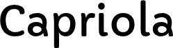
Capriola from Sorkin Type Co is a free rounded sans serif with an easygoing, hand-shaped appearance. Its sturdy strokes change width gently, and the softened ends keep the letters warm rather than mechanical. The tall lowercase forms are especially distinctive.
It can lend children's publishing a friendly voice, yet its clean silhouette also suits cafe branding, food packaging, and informal event posters. The rounded shapes speak most directly to family audiences and brands that want approachable lettering without the bounce of a cartoon face.
Capriola is a sans-serif typeface whose unique style draws upon forms seen in handwriting and italic types. Skeletons of the most characteristic glyphs are inspired by quick handwriting and based on a single hand movement (G,a,g,k,e). Capriola ambitiously seeks to push the boundaries of originality in the genre without losing legibility. The unusual glyphs are quite noticeable in large sizes which allows for distinctive headlines. However in small sizes these gestures become less noticeable making it possible to set longer texts. The name "Capriola" means somersault in English. Such glyphs as "a", "e" or "G" are the real acrobats and the "g" makes a double salto! Capriola was spaced for web. Capriola's originality combined with utility makes it ideal for a wide range of uses.
Extended font information
Platforms supported
PlatformEncoding
UnicodeUnicode 2.0 and onwards semantics, Unicode BMP only.
MacintoshRoman
MicrosoftUnicode BMP only
Font details
Created2012-06-05
Revision1
Glyph count425
Units per Em2048
Embedding rightsEmbedding for permanent installation
Family classSans serif
WeightMedium (normal)
WidthMedium (normal)
Mac styleBold
DirectionOnly strongly left to right glyphs + contains neutrals