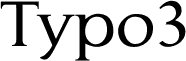
Contra font by Fredrick Nader is a free serif typeface that gives text a calm, literary voice without feeling stuffy. Its rounded curves, firm verticals, and gently flared serifs create a steady rhythm that’s easy on the eyes, so long passages feel smooth rather than tiring. Letters sit close enough to feel compact, yet still breathe, which keeps paragraphs tidy and headlines confident on the page.
Using Contra, you get a bookish warmth that works beautifully for novels, essays, blogs, editorial layouts, brand storytelling, and thoughtful posters. This free font shines when you want something readable with a quiet edge of personality, especially in print or long-form digital reading. Try pairing Contra for body text with a clean geometric sans for navigation and small captions to keep your layouts both clear and characterful.