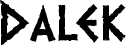
Dalek font by Keith Bates is a free distressed display typeface that looks like it’s been scraped onto metal by some ancient, hostile machine. Its jagged small caps, uneven edges, and echo of Greek, Phoenician, and Runic alphabets give every word a rough, cult‑sci‑fi energy-half vintage comic, half alien warning. The letters feel gouged and inky, with just enough rhythm to stay readable while still looking wonderfully unstable.
Using Dalek, you can instantly give sci‑fi posters, comic titles, retro zines, game logos, event flyers, and fan merch a raw, TV21-style punch. This free font shines at large sizes where its eroded texture can really bite into the page or screen; pair it with a clean sans serif for supporting text to keep things legible while Dalek does the shouting.
--
The latest version includes a full complement of Latin Extended-A characters and outline improvements.
The original medium weight is available for free download for personal use. The family now also includes Heavy and Light weights, which are available from the link below.
https://www.k-type.com/fonts/dalek/