Author's note

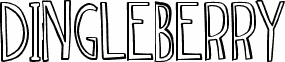
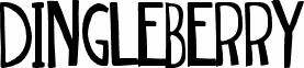
Dingleberry Solid by Dylan Tellesen and Max Infeld of Xerographer.com is a free distorted display font with tall, tightly packed letterforms and an unruly cut-paper silhouette. Stroke widths shift abruptly, curves bulge in unexpected places, and the uneven tops and bottoms keep the alphabet deliberately off balance.

Independent record labels and eccentric clothing brands could use its raw, handmade-looking shapes for logos, packaging, and merchandise with a scrappy underground edge. The same crooked construction suits comedy posters and youth event graphics, where the lettering can become part of the artwork rather than a neutral caption for a lively promotional voice.

--

DINGLEBERRY and DINGLEBERRY SOLID by Dylan Tellesen and Xerographer.

PayPal donations:
maxinfeld@hotmail.com

Suggested donation: $5–$10.

Contact for any commercial use or licensing.

Xerographer on Facebook:
http://www.facebook.com/infeld
Tags

Character map

Please use the pulldown menu to view different character maps contained in this font.
Basic Latin - Character map

Basic font information

Copyright notice
Typeface © Xerographer Foundry. 2012. All Rights Reserved
Font family
dingleberry solid
Font subfamily
Regular
Unique subfamily identification
dingleberry solid:Version 1.00
Full font name
dingleberry solid
Name table version
Version 1.00 March 4, 2012, initial release
Postscript font name
dingleberrysolid
Manufacturer name
Designer
Description
dingleberries solid is weird

Extended font information

Platforms supported

PlatformEncoding
UnicodeUnicode 2.0 and onwards semantics, Unicode BMP only.
MacintoshRoman
MicrosoftUnicode BMP only

Font details

Created2012-02-18
Revision1
Glyph count55
Units per Em2048
Embedding rightsEmbedding for editing allowed
Family classNo classification
WeightSemi-light
WidthCondensed
Mac styleBold
DirectionOnly strongly left to right glyphs
Pattern natureRegular
Complete pack contains 2 font weights listed below:
dingleberry solid.ttf
dingleberry.ttf