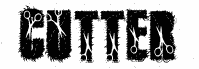
Docteur Atomic font by Jonathan Paquette hits like ink that’s been sandblasted-bold, blocky letterforms with gritty gaps, scuffed edges, and a worn-through texture that feels industrial and a little radioactive. It’s a free eroded display font, and the typeface’s broken surface gives headlines instant history without needing extra distress effects.
Using Docteur Atomic, your words come out louder and rougher: band posters, zines, album covers, skate stickers, dystopian game titles, sci‑fi warning labels, and Halloween promos all benefit from its gritty punch. Keep it large and give it a touch of extra spacing so the erosion stays readable, then pair it with a clean neutral sans for body copy-this free font does the shouting.