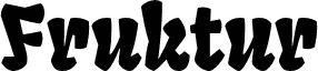
Fruktur by Sorkin Type Co is a free comic display font with chunky, irregular letters and a mischievous cut-paper look. Broad shapes shift between blunt curves and sharp wedges, and the changing widths, tilted details, and pinched joins give the lettering a rowdy, hand-cut rhythm.
A candy or snack brand could use its playful bite for packaging, shop signage, and family event posters. In game graphics and children's merchandise, the crooked silhouettes can become part of a monster, jungle, or storybook emblem, turning the name itself into a piece of the illustration.
Fruktur appears to be a playful and powerful black letter type at Fruktur initially appears to be a playful and powerful black letter type with a warm friendly feeling. However its construction is closer to that of an upright italic. Fruktur offers some of the feeling of a black letter but with higher legibility and greater utility than is typical of black letter type. Fruktur will be most useful from medium to large sizes.
Extended font information
Platforms supported
PlatformEncoding
UnicodeUnicode 2.0 and onwards semantics, Unicode BMP only.
MacintoshRoman
MicrosoftUnicode BMP only
Font details
Created2013-01-10
Revision1
Glyph count437
Units per Em2048
Embedding rightsEmbedding for permanent installation
Family classNo classification
WeightBold
WidthMedium (normal)
Mac styleBold
DirectionOnly strongly left to right glyphs + contains neutrals