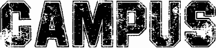
GF Ordner, a free eroded caps display font by Lorenz Goldnagl, has the blunt, battered look of stamped filing labels and worn office signage. The letters are boxy and upright, with chipped corners, ragged edges, and a few drippy breaks that make the alphabet feel handled, scuffed, and slightly grimy.
It fits poster work, record sleeves, zines, title cards, packaging, and short branding where a free font with a rough bureaucratic mood feels right. Because the caps are so compact and blocklike, it works best in brief settings-cover lines, section headers, initials, and monograms-where those uneven cuts can do the talking.