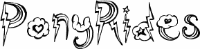
Glidepath font by mik+ is a free handwritten outlined typeface that looks like it was sketched with a slightly wobbly marker and traced twice. The letters are tall, loose, and hollow, with inky, irregular strokes that feel like doodles pulled straight from a notebook margin. That rough outline keeps it playful and human, while the consistent rhythm across the characters stops it from becoming messy or hard to read.
Using Glidepath, you get a bold, casual voice that shines on gig posters, zines, stickers, YouTube thumbnails, kids’ event flyers, and quirky brand logos or packaging. This free font loves big sizes where its uneven lines and open interiors can really breathe. For longer copy or small print, pair it with a simple, neutral sans-serif so Glidepath can stay center stage as your headline or accent style.