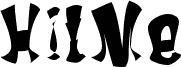
HitMe font by Thebluejoker is a free distorted display typeface that looks like it’s been stretched, splashed, and left to drip in the dark. Each letter leans and bulges in unexpected ways, with thick inky strokes that feel almost liquid, giving headlines a warped, uneasy energy. It’s loud, irregular, and a little unhinged-perfect when you want text to feel more like a graphic element than quiet reading material.
Using HitMe, you can crank up the tension on horror movie titles, Halloween party flyers, underground zines, gig posters, album covers, or bold YouTube thumbnails. The unstable rhythm keeps the eye moving, so short words and punchy phrases really slam off the page. This free font works best at big sizes; pair it with a simple geometric sans serif for body copy to keep everything readable while HitMe steals the spotlight.