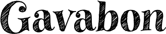
Karabine, Jonathan Paquette's free trash serif font, looks like a battered letterpress pulled from a noisy punk zine. The letters are broad and old-style in spirit, but every edge is scraped, frayed, and peppered with gritty texture, giving the whole font a rough printed feel rather than a neat retro revival.
That makes it a natural pick for poster headlines, album art, small-press book covers, underground event flyers, and title cards that need some abrasion without losing their serif backbone. As a free font, karabinE works best where the distressed surface can do real work - in short bursts, big names, and cover lines that want history, noise, and a little damage.