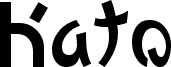
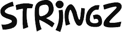
Kato, Keith Bates' free Japanese-inspired display font, gives Latin letters a brushy, calligraphic rhythm that feels pulled from signage rather than straight type. The letters mix heavy, rounded forms with sharp flicks and curling ends, so the font feels lively and slightly theatrical without losing its simple, hand-drawn pulse.
It fits posters, restaurant branding, album sleeves, event flyers, and title cards where a short line needs that East Asian brush-note more than strict neutrality. As a free font, Kato also works well for logos, cover lines, and monogram-like initials, because those hooked curves and sweeping turns carry plenty of mood in just a few characters.
--
Originally conceived as two separate Japan-inspired fonts, the upper and lower cases can be mixed at the typographer's own risk.