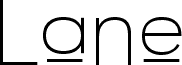
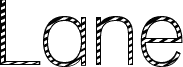
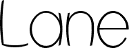
Lane Upper font by Graham Meade is a free retro display font with a narrow, monoline structure and soft rounded ends. Its letterforms feel airy and geometric, with a distinctive line-based construction that gives the whole face a clean, stripped-back rhythm.
Lane Upper works well for logos, poster titles, editorial accents, packaging, and short signage where that streamlined shape can carry the layout. It fits projects that need a stylized retro touch without extra ornament, especially when the design calls for clear spacing and a pared-down graphic line.