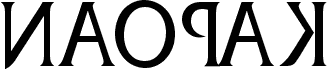
Naopak by Nikola Kovanovic is a free Cyrillic serif with a clever mirror-play built into its classical, high-contrast letters. The caps feel rooted in old-style Roman display lettering, yet the reversed logic gives the font a sly, off-kilter rhythm that keeps it from feeling formal or museum-bound.
That mix suits posters, book covers, cultural event graphics, title cards, and editorial cover lines where a free font can carry both tradition and visual wit. It also works well for monograms and short wordmarks, because the sharp serifs and flipped letterforms make even brief settings feel deliberate and a little unsettling.