Author's note

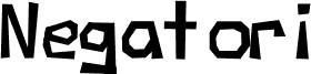
Negatori by High-Logic is a free comic display font whose crooked, cut-paper silhouette gives the lettering a loose ransom-note character. The uneven angles, shifting tilt, and blunt polygonal shapes keep the rhythm jumpy and homemade rather than smooth or neatly cartooned.

That restless shape makes sense on zine covers, kids' activity flyers, party invitations, scrapbook titles, and quirky poster headlines where a straight, orderly font would feel too calm. Short packaging callouts and handmade shop signs also benefit from its off-kilter bounce, especially when you want the text to look assembled, improvised, and a little mischievous.
Tags

Character map

Please use the pulldown menu to view different character maps contained in this font.
Basic Latin - Character map

Basic font information

Copyright notice
Typeface © High-Logic. 1999, 2000. All Rights Reserved
Font family
Negatori
Font subfamily
Regular
Unique subfamily identification
High-Logic: NewFont Regular:1999, 2000
Full font name
Negatori
Name table version
Version 1.02; Januari 29, 2000
Postscript font name
Negatori
Trademark notice
Negatori is a registered trademark of High-Logic.
Manufacturer name
High-Logic
Designer
Description
This is the first font that I've ever designed, but I'm very satisfied with the results.

Extended font information

Platforms supported

PlatformEncoding
MacintoshRoman
MicrosoftUnicode BMP only

Font details

Created1999-08-30
Revision1
Glyph count247
Units per Em2048
Embedding rightsEmbedding for editing allowed
Family classNo classification
WeightMedium (normal)
WidthSemi-expanded
Mac styleBold
DirectionOnly strongly left to right glyphs + contains neutrals
Pattern natureRegular
PitchNot monospaced