Author's note

Rather Unfortunate is a free old-school decorative display font with lanky, uneven letters and a mischievous storybook air. Sharp points, bulbous curves, and recurring spiral tips give the lettering a deliberately unruly silhouette, like hand-cut title work from a strange theatrical poster.

It can turn a title into part of the illustration. That role makes it especially apt for Halloween posters, eccentric book covers, game graphics, and music merchandise, where the curling shapes support gothic comedy, dark fairy tales, or offbeat fantasy.

--

For personal use, please email me a copy of your work.

Commercial use requires a licensing agreement. Please contact me to discuss the cost.

A $1 donation for personal use may be sent to:

roxanne.michael@live.com.au

Rather Unfortunate is based on the movie A Series of Unfortunate Events.

Rather Unfortunate — Roxy Coppen, 2012
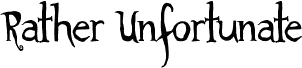
Rather Unfortunate — Font presentation

Tags

Character map

Please use the pulldown menu to view different character maps contained in this font.
Basic Latin - Character map

Basic font information

Font family
Rather Unfortunate
Font subfamily
Regular
Unique subfamily identification
1.000;pyrs;RatherUnfortunate
Full font name
Rather Unfortunate
Name table version
Version 1.000
Postscript font name
RatherUnfortunate
Manufacturer name
Roxy Coppen
Designer

Extended font information

Platforms supported

PlatformEncoding
UnicodeUnicode 2.0 and onwards semantics, Unicode BMP only.
MacintoshRoman
MicrosoftUnicode BMP only

Font details

Created2012-04-23
Revision1
Glyph count79
Units per Em2048
Embedding rightsEmbedding for preview & printing allowed
Family classScripts
WeightSemi-bold
WidthMedium (normal)
Mac styleBold
DirectionOnly strongly left to right glyphs + contains neutrals
Pattern natureRegular