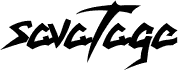
Savatage is a free modern gothic font with a hard-edged blackletter attitude. The letters lean into jagged cuts, hooked corners, and long blade-like strokes, giving the alphabet a fast, metallic feel that reads closer to band insignia and dark fantasy lettering than to traditional old-world gothic.
This free font makes sense on album covers, poster headlines, merch graphics, title cards, and monograms where a few letters need to carry drama on their own. It also fits game branding and chapter openers, because those sharp, sweeping forms create a tense silhouette even in very short words.
Monotype:Times New Roman Regular:Gilberto Bressan Junior
Full font name
savatage
Name table version
Gilberto Bressan Junior Version 1.0
Postscript font name
savatage
Trademark notice
savatage
Manufacturer name
Monotype Typography
Designer
Monotype Type Drawing Office - Stanley Morison, Victor Lardent 1932
Description
This remarkable typeface first appeared in 1932 in The Times of London newspaper, for which it was designed. It has subsequently become one of the worlds most successful type creations. The original drawings were made under Stanley Morison's direction by Victor Lardent at The Times. It then went through an extensive iterative process involving further work in Monotype's Type Drawing Office. Based on experiments Morison had conducted using Perpetua and Plantin, it has many old style characteristics but was adapted to give excellent legibility coupled with good economy. Widely used in books and magazines, for reports, office documents and also for display and advertising.