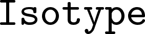
Selectric, a free fixed-width serif by Paradox, channels the crisp, slightly mechanical poise of typewriter lettering without losing a bookish tone. The letters pair even spacing with firm serifs and clean, open shapes, so the font feels orderly and deliberate rather than nostalgic for its own sake.
That makes it a natural fit for editorial pull quotes, film title cards, coding-themed posters, packaging copy, and album or book covers that want a literate, machine-set flavor. As a free font, it also works well for short headlines and monograms, where the steady rhythm of the letters gives brief words a calm, unmistakably typed presence.