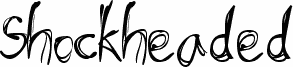
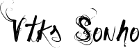
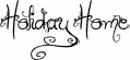
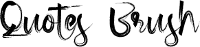
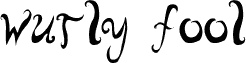
Shockheaded by Meir Sadan is a free trash display font with a scratchy, hand-scrawled attitude. Its letters look tugged and tangled from wiry strokes, mixing long, awkward verticals with rough loops and overlaps that give the alphabet a nervy, slightly unhinged rhythm.
That makes it a strong fit for zines, poster headlines, indie music flyers, horror-comedy title cards, and edgy packaging where a free font should feel raw rather than tidy. It works best in short phrases, cover lines, or monogram-like initials, because the spidery drawing and restless linework carry more mood than polish.
Yep. Another one of those contemporary grunge handjobs (and I do mean "contemporary"). I find it to be a mixture of Lovitz and Serena into something so off-mind, so impractical, that even the public access programs won't dare to use.
I got the name from the book "Shockheaded Peter", which is quite a favorite of mine, especially because of all of these freaky drawings they have there. There's a british show that's based on that story, which I definately intend to go see.