Author's note

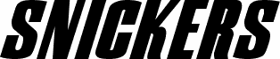
Snickers by Samuel Park is a free slanted caps display font with a hard-driving, late-90s commercial feel. The letters are cut tall and heavy, with sharp diagonals and tight spacing that make the whole wordmark read like motion, while the rounded curves in forms like S and C keep it from feeling purely mechanical.

It fits branding that wants a fast, punchy voice - snack packaging, sports promos, poster headlines, title cards, and bold cover lines all make sense here. As a free font, it is most convincing in short bursts where that compressed lean and oversized weight can do the work, especially for logos and monograms that need a brisk, branded push.
Tags

Snickers Normal font character map

Please use the pulldown menu to view different character maps contained in this font.
Snickers Normal font character map: Basic Latin, page 1

Glyphs in the Snickers Normal font — Basic Latin, page 1

Basic font information

Copyright notice
© Samuel Park 2000 - http://www.peppesbodega.nu/type
Font family
Snickers
Font subfamily
Normal
Unique subfamily identification
SnickersRegular(Oblique)
Full font name
Snickers Normal
Name table version
02-02-00
Postscript font name
SnickersNormal
Trademark notice
Samuel Park 2000

Extended font information

Platforms supported

PlatformEncoding
UnicodeUnicode 1.0 semantics
MacintoshRoman
MicrosoftUnicode BMP only

Font details

Created2000-02-16
Revision1
Glyph count179
Units per Em1000
Embedding rightsEmbedding restricted (not allowed!)
Family classSans serif
WeightBold
WidthExtra-condensed
Width typeNormal
Mac styleBold
DirectionOnly strongly left to right glyphs + contains neutrals
Pattern natureItalic
StyleUpright
Stroke weightBook, text, regular, etc.
PitchNot monospaced
Symbol setWindows 3.1 ANSI
Complete pack contains 2 font weights listed below:
snicn.ttf
SNICSN__.TTF