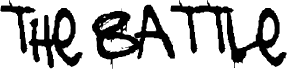
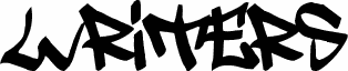
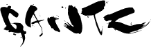
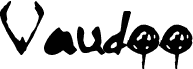
The Battle Continuez, a free graffiti font, has the raw look of a fast wall tag pulled with a loaded brush. The letters feel wet, uneven, and a little unruly, with thick painty strokes, torn edges, and drips that keep the whole font moving.
It fits music flyers, streetwear branding, skate graphics, mixtape covers, and title cards where you want the lettering to feel improvised rather than polished. Used as a free font for short headlines, poster names, or bold monogram-style initials, it brings that hand-hit marker energy that works best when the words are brief and loud.