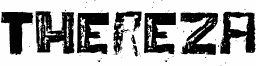
Thereza is a free eroded display font from an experimental 2005 PUC-Rio project, with a rough industrial feel that looks stamped, scraped, and weathered. The letters are heavy, blocky, and all caps in tone, but the broken interiors and ragged edges keep them from feeling blunt or static.
It fits poster titles, record sleeves, festival graphics, zine covers, and gritty brand marks where you want the wording to feel worn in rather than neatly drawn. As a free font, it also works well for short headlines, title cards, and monogram-like initials, because the distressed texture gives even a few letters a strong, immediate presence.