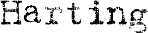
Underwood 1913 Normal by Gilles Le Corre is a free eroded typewriter display font with a worn, early 20th-century newsroom feel. The letters look inked through a tired ribbon, with rough edges, soft breaks, and sturdy serif shapes that keep the typewriter reference grounded rather than nostalgic for its own sake.
It fits poster headings, book jackets, period packaging, editorial title cards, and cafe or bar branding where that battered imprint can do some of the storytelling. As a free font, it is especially at home in short headlines, pull quotes, and stamped-looking labels, because the broken texture gives even plain words a used, handled presence.
--
Updated in 2008. For commercial use (15) of this reduced font and/or for the full commercial font (25), please visit my website or contact me.