Author's note

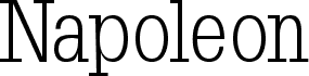
Usenet, by Alejandro Paul and Apostrophic Laboratories, is a free high-contrast serif font with a cool editorial tone. The letters pair very thin hairlines with broad, smooth curves, giving it a late-20th-century magazine feel that is crisp without turning severe.

It fits book jackets, culture and fashion headlines, mastheads, poster titles, and refined branding where a little contrast can carry the page. As a free font, it feels most at home in short display settings, cover lines, and monogram-like initials, because the tall, elegant shapes and delicate joins do their best work when given space.

Tags

Character map

Please use the pulldown menu to view different character maps contained in this font.
Basic Latin - Character map

Basic font information

Copyright notice
© Alejandro Paul & Apostrophic Laboratories. All rights reserved. apostrofe@mail.com
Font family
Usenet
Font subfamily
Regular
Unique subfamily identification
Apostrophe&AlejandroPaul: Usenet: 2000
Full font name
Usenet
Name table version
Version 1.5; 2000
Postscript font name
Usenet
Designer
Apostrophe & Alejandro Paul
Description
© Alejandro Paul & Apostrophic Laboratories. All rights reserved. apostrofe@mail.com

Extended font information

Platforms supported

PlatformEncoding
MacintoshRoman
MicrosoftUnicode BMP only

Font details

Created2000-07-14
Revision1
Glyph count232
Units per Em1000
Embedding rightsEmbedding for permanent installation
Family classClarendon serifs
WeightSemi-light
WidthMedium (normal)
Mac styleBold
DirectionMixed directional glyphs
Pattern natureRegular
PitchNot monospaced