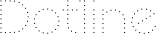
Veron by Paulo R. is a free geometric sans serif with extremely light monoline strokes and tall, spacious capitals. Broad circles contrast with sharply pointed diagonal forms.
As a refined display voice, its spare construction can shape fashion branding, gallery posters, and architectural event graphics, especially when the lettering needs to echo clean line drawings or precise geometric imagery. The same airy geometry also suits book covers and premium cosmetics packaging, where the slender forms can become part of a coordinated visual system of fine lines, circles, and angular illustrations rather than acting as ordinary labeling across the page or container.
--
Veron by Paulo R. is a free geometric sans serif.
The Normal and Bold versions include some alternate lowercase characters. All three fonts are kerned.
This is the second and final update to the Veron font. All glyph metrics and heights were adjusted.
More information about the creator and their work is available at:
https://www.facebook.com/Skomii.PauloR