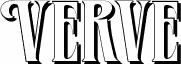
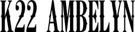
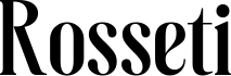
Verve Alternate, a free retro display font from Typographer Mediengestaltung with a full character set added by Dieter Steffmann, leans into a late Art Nouveau mood with tall caps, soft bulb-like curves, and dramatic thick-to-thin shifts. The letters feel elongated and theatrical, with narrow joins and rounded inner shapes that give the font a poster-era rhythm rather than a strict geometric snap.
It fits naturally in vintage branding, music posters, cocktail menus, magazine cover lines, and title cards where a little period glamour helps carry the message. As a free font, it is especially useful for short headlines, monograms, and drop caps, because those stretched forms and creamy curves do their best work when the letters have room to breathe.