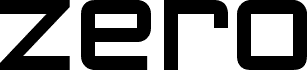
Zeroes by Ray Larabie is a free geometric display font with a cool late-modernist tone. The letters are built from broad, even strokes and near-circular forms, while the squared cuts in shapes like E and R keep it feeling spare, synthetic, and a little retro-futurist.
It works well anywhere you want that clean machine-age mood to do the talking - posters, music packaging, title cards, tech branding, and magazine cover lines all make sense for this free font. Because the forms are so reduced and rounded, it also suits short logos, monograms, and single-word headers where the geometry stays crisp and memorable.
Larabie Fonts is able to offer unique free fonts through the generous support of visitors to the site. Making fonts is my full-time job and every donation, in any amount, enables me to continue running the site and creating new fonts. If you would like to support Larabie Fonts visit www.larabiefonts.com for details.
Extended font information
Platforms supported
PlatformEncoding
UnicodeUnicode 2.0 and onwards semantics, Unicode BMP only.
MacintoshRoman
MicrosoftUnicode BMP only
Font details
Created2004-02-23
Revision2
Glyph count196
Units per Em1000
Embedding rightsEmbedding for permanent installation
Family classSans serif
WeightMedium (normal)
WidthExpanded
Width typeNormal
Mac styleBold
DirectionOnly strongly left to right glyphs + contains neutrals
Pattern natureRegular
StyleUpright
Stroke weightBook, text, regular, etc.
PitchNot monospaced
Symbol setWindows 3.1 ANSI
Complete pack contains 2 font weights listed below: