Bleu Feelin Mono
TrueTypeDonationware
BlueFeelinMono-trial.ttf
Tags
Author's note
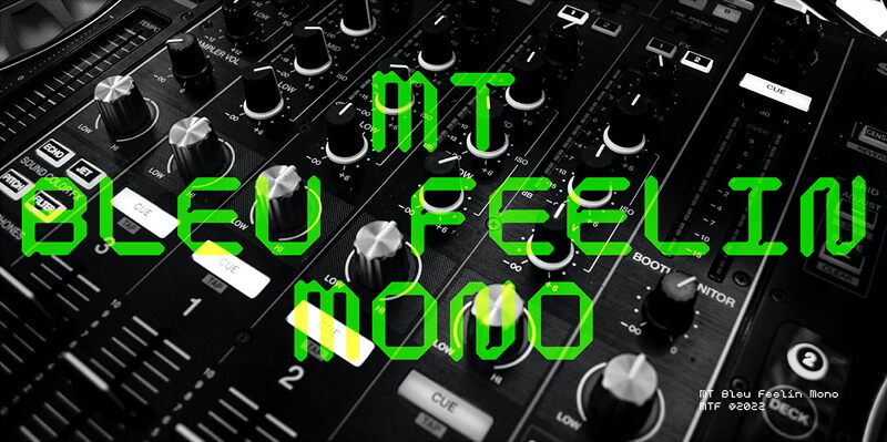
MT Bleu Feelin is a display font with a monospace typographic feel. Please pay attention to Small Caps, Oldstyle Figures, and Alternates. Good for music album covers, posters and magazines. Inspired by the electronic band from Bandung, Bleu House, which has a light and edgy electronic pop experimental music character, the idea emerged to create a font that changes from sound to visual language, namely font.
The use of the design for this font is for Display, and while it is issued one regular weight, in the future will develop multiple masters and other experiments.
The design concept of the MT Bleu Feelin Mono Regular font is to take a 45 degree diagonal and geometric cut technique. also every corner is rounded which gives a dynamic impression like electronic music.
I created this font design because I like visual experiments, and applied it to the character of the font.
By using monospaced font characters have an even width. This is a unique feature in that most fonts are 'proportionally' spaced with characters varying in width.
While monospace is perfect in certain ways, it is a proportional font that reigns supreme. Proportional fonts are faster to read. however, the MT Bleu Feelin Mono Regular font is intended for display fonts.
donation paypal : mmayarusli@gmail.com
Character map
Please use the pulldown menu to view different character maps contained in this font.

Basic font information
Font family
Bleu Feelin Trial
Font subfamily
Regular
Unique subfamily identification
1.000;UKWN;BlueFeelinMono-trial
Full font name
Bleu Feelin Mono
Name table version
Version 1.000
Postscript font name
BlueFeelinMono-trial
Trademark notice
MTF are registered trademarks of Mametos Ltd.
Preferred family
Bleu Feelin Trial
Preferred subfamily
Regular
Extended font information
Platforms supported
PlatformEncoding
UnicodeUnicode 2.0 and onwards semantics, Unicode BMP only.
MicrosoftUnicode BMP only
Font details
Created2022-09-09
Revision1
Glyph count99
Units per Em1000
Embedding rightsEmbedding for editing allowed
Family classNo classification
WeightSemi-light
WidthSemi-expanded
Mac styleBold
DirectionOnly strongly left to right glyphs + contains neutrals
Pattern natureRegular
PitchNot monospaced