DiagaNO
TrueTypePersonal use
- Accents (partial)
- Euro
DiagaNO.ttf
Tags
Author's note
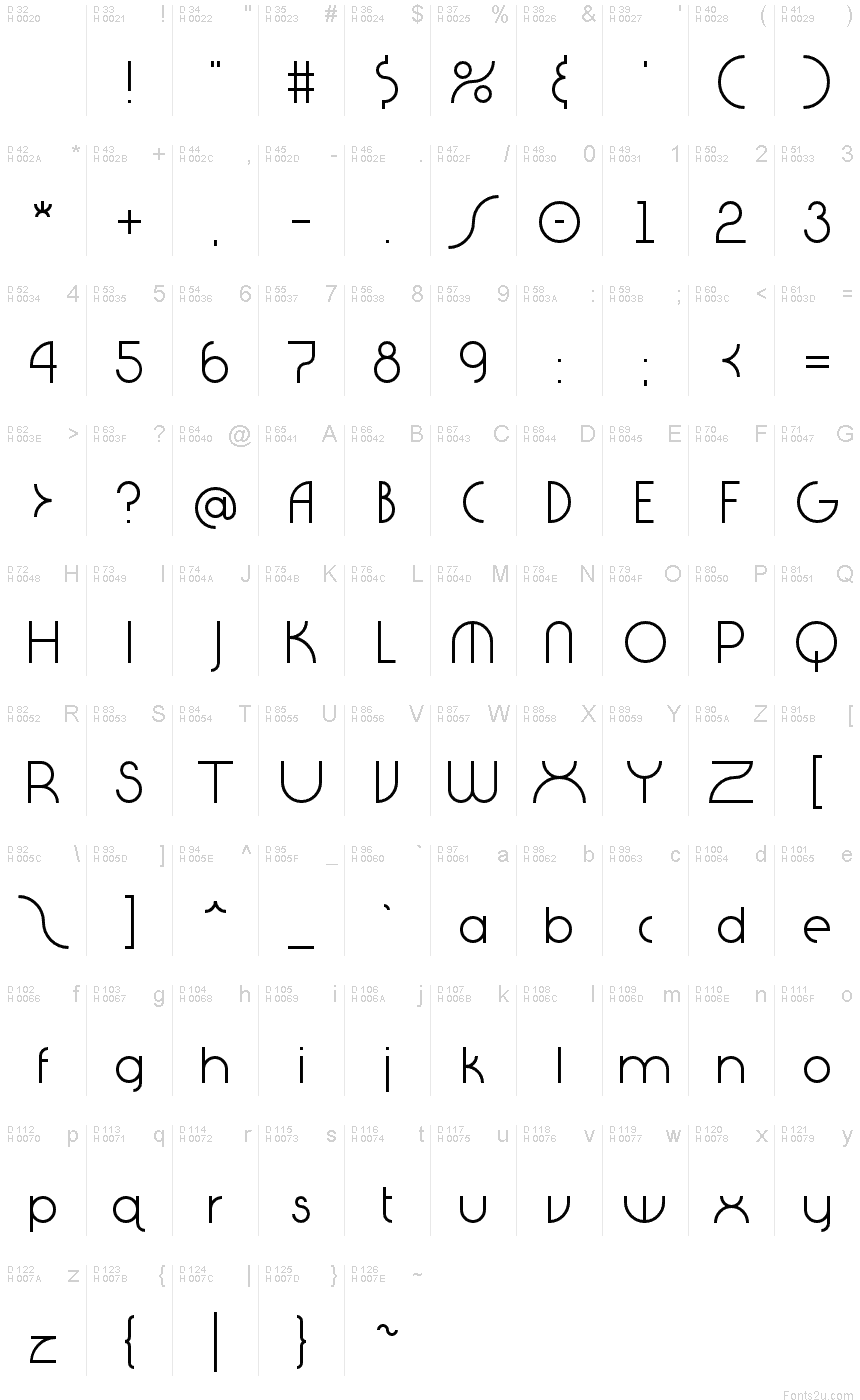
It all started with the letter "Q". I had an idea to create the tail going straight up and down...similar to the "power" symbol on many electronics. Then I thought, "What would the alphabet look like if we couldn't or didn't use diagonal lines?" This is the result...nothing connects, aligns, or cuts unless it is on a multiple of 90 angles. The font ended up having a slight geometric/art deco feel to it.
Character map
Please use the pulldown menu to view different character maps contained in this font.

Basic font information
Copyright notice
Typeface © Essqué Productions. 2012. All Rights Reserved
Font family
DiagaNO
Font subfamily
Regular
Unique subfamily identification
DiagaNO:Version 1.00
Full font name
DiagaNO
Name table version
Version 1.00 September 4, 2012, initial release
Postscript font name
DiagaNO
Manufacturer name
Designer
Stephen Knouse
Description
This font was created using FontCreator 6.5 from High-Logic.com
Extended font information
Platforms supported
PlatformEncoding
UnicodeUnicode 2.0 and onwards semantics, Unicode BMP only.
MacintoshRoman
MicrosoftUnicode BMP only
Font details
Created2012-03-29
Revision1
Glyph count237
Units per Em2048
Embedding rightsEmbedding for editing allowed
Family classSans serif
WeightLight
WidthMedium (normal)
Mac styleBold
DirectionOnly strongly left to right glyphs
Pattern natureRegular
PitchNot monospaced