Lourde Regular
TrueTypeFreeware
- Accents (partial)
- Accents (full)
- Euro
lourde.ttf
Tags
Author's note
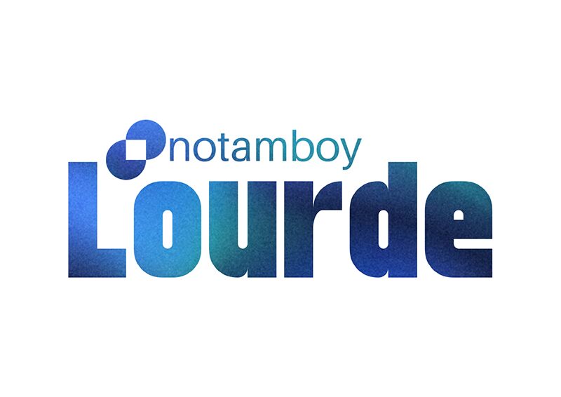
Lourde font by Notamboy captivates the eye with its modern aesthetic, strong presence, and versatile use in all projects. This bold condensed sans serif concept is built on a geometric structure which contributes to the overall impactful visual. Every single letter in this free font has an equal place in the final text regardless of its position.
The undertakings Lourde was built for includes (but are not limited to): advertisements, headlines, titles, branding ideas, logos, and packaging. Websites can also enjoy a touch of modernism with it as well as invitations such as those for business or for personal occasions and parties.
--
The undertakings Lourde was built for includes (but are not limited to): advertisements, headlines, titles, branding ideas, logos, and packaging. Websites can also enjoy a touch of modernism with it as well as invitations such as those for business or for personal occasions and parties.
--
Character map
Please use the pulldown menu to view different character maps contained in this font.

Basic font information
Copyright notice
Copyright notamboy 2023
Font family
Lourde
Font subfamily
Regular
Unique subfamily identification
Lourde
Full font name
Lourde Regular
Name table version
Version 1.0
Postscript font name
Lourde
Trademark notice
FontStruct is a trademark of FontStruct.com
Manufacturer name
Designer
Description
“Lourde” was built with FontStruct
Designer description: This is my first ever font using ideas to make an heavy sans-serif typeface. I was inspired by elmoyenique and Jamie Place (FontBlast). I'm not stealing ideas from anybody by the way, I've wanted to share something to explain a journey of making my own fonts in life.
I got some aspect of making the glyphs look heavier. I've tried to make the letter f, but it flawlessly has the same height as the other glyphs. If I make number four, than I've obviously make it like this because the slanted bricks are not enough to make up a four glyph. Some of the glyphs (for example: ð, ß, ™, ®) are hard to build it because it was considered to be rounded by its curve and too small if the text was heavier.
When I run out of name ideas, the only idea of this font name i've chose is Lourde (french word for heavy).
Extended font information
Platforms supported
PlatformEncoding
UnicodeUnicode 2.0 and onwards semantics, Unicode BMP only.
Unicode 2.0 and onwards semantics, Unicode full repertoire.
MicrosoftUnicode BMP only
Font details
Created2023-08-06
Revision1
Glyph count634
Units per Em1024
Embedding rightsEmbedding for preview & printing allowed
Family classSans serif
WeightBold
WidthCondensed
Mac styleBold
DirectionOnly strongly left to right glyphs + contains neutrals
Pattern natureRegular