Author's note

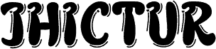
Verdy Evolution by 1-2-3 GO! and Jonathan Paquette is a free distorted display font with a rough, photocopied energy. The letters look thick and soft-edged, then knocked sideways by jittery outlines and doubled contours, giving the whole font a noisy, urban wobble that feels more zine than polished poster.

That makes it a natural fit for club flyers, mixtape covers, skate graphics, indie magazine headers, and title cards where a little visual interference helps set the tone. As a free font, it works best in short bursts - logo treatments, big pull quotes, and compact headlines - because the layered, trembling edges do much of the talking.

Tags

Character map

Please use the pulldown menu to view different character maps contained in this font.
Basic Latin - Character map

Basic font information

Copyright notice
1-2-3 GO! © Jonathan Paquette, 2006. Tous droits réservés
Font family
verdy évolution
Font subfamily
Regular
Unique subfamily identification
verdy évolution:Version 1.00
Full font name
verdy évolution
Name table version
Version 1.00 July 2, 2006, initial release
Postscript font name
verdyvolution
Trademark notice
1-2-3 GO!® Jonathan Paquette 2006
Designer
Jonathan Paquette
Description
This font was created using Font Creator 5.0 from High-Logic.com

Extended font information

Platforms supported

PlatformEncoding
MacintoshRoman
MicrosoftUnicode BMP only

Font details

Created2006-07-02
Revision1
Glyph count653
Units per Em2048
Embedding rightsEmbedding for editing allowed
Family classNo classification
WeightBold
WidthMedium (normal)
Mac styleBold
DirectionOnly strongly left to right glyphs
Pattern natureRegular
PitchNot monospaced