Author's note

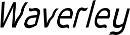
Waverley Bold by Keith Bates is a free distorted display font with tall, uneven letters and a deliberately warped silhouette. Broad strokes swell and pinch as they move through the forms, producing soft bends, sudden angles, and an offbeat hand-cut quality.

A music poster is a good setting for this restless lettering, with album artwork and event graphics close behind. Its irregular shapes can echo collage, photocopied textures, or loose illustration rather than behaving like neutral type. It can also give snack packaging or an independent clothing label a quirky, slightly unruly voice. Posters remain its clearest use because the bent forms turn a title into part of the artwork.

Tags

Waverley Bold font character map

Please use the pulldown menu to view different character maps contained in this font.
Waverley Bold font character map: Basic Latin, page 1

Glyphs in the Waverley Bold font — Basic Latin, page 1

Basic font information

Copyright notice
Waverley Bold (version 3.01) by Keith Bates K-Type © 2001, 2007  www.k-type.com  keith@k-type.com
Font family
Waverley
Font subfamily
Bold
Unique subfamily identification
Macromedia Fontographer 4.1.5 Waverley Bold
Full font name
Waverley Bold
Name table version
Macromedia Fontographer 4.1.5 3/7/04
Postscript font name
Waverley-Bold

Extended font information

Platforms supported

PlatformEncoding
UnicodeUnicode 2.0 and onwards semantics, Unicode BMP only.
MacintoshRoman
MicrosoftUnicode BMP only

Font details

Created2004-07-03
Revision1
Glyph count267
Units per Em1000
Embedding rightsEmbedding for preview & printing allowed
Family classSans serif
WeightMedium (normal)
WidthSemi-condensed
Mac styleItalic
DirectionOnly strongly left to right glyphs + contains neutrals
Pattern natureRegular
PitchNot monospaced
Complete pack contains 4 font weights listed below:
WAVEB___.ttf
WAVERLEY.ttf
WAVEBI__.ttf
WAVEI___.ttf